I'm so excited to come back home, but I'm very sad to leave Dove's Drawing for Sequential Art class. This has easily been my favorite class I have ever taken. I have learned so much and come so far---this is all very evident in my final piece.
For our final project, we were asked to draw a 3-point perspective illustration that took place on River Street in Savannah, Georgia. It would be 10x15" on bristol board, rendered in graphite, and was required to contain at least three figures. No one was very excited about the project until we took a field trip instead of having a regular class day.
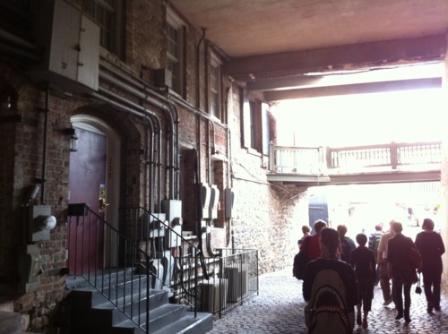
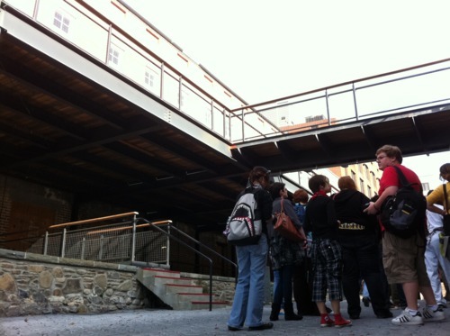
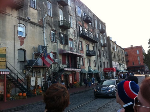
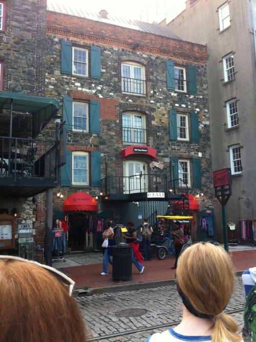
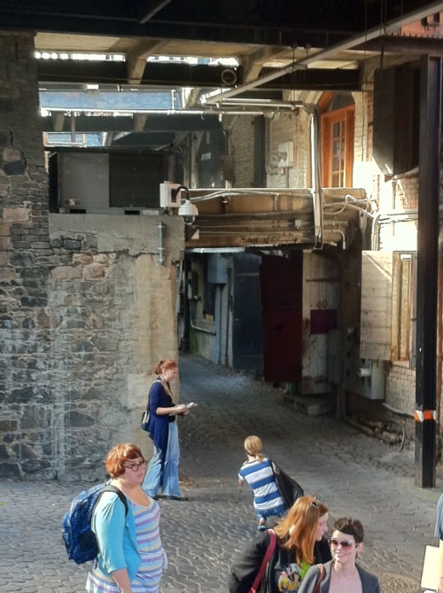
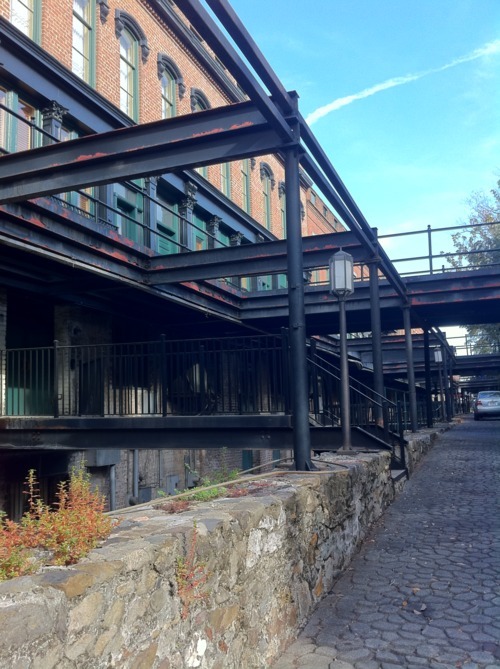
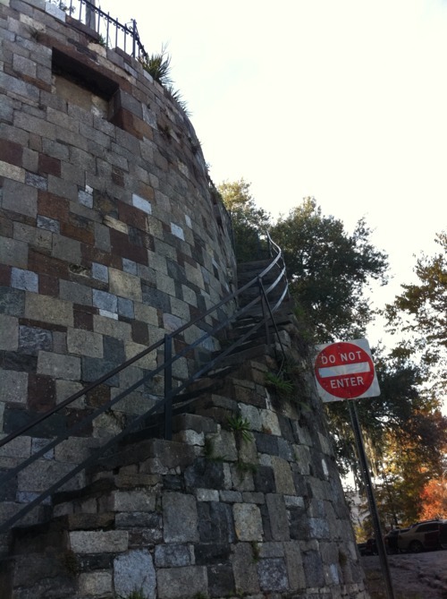
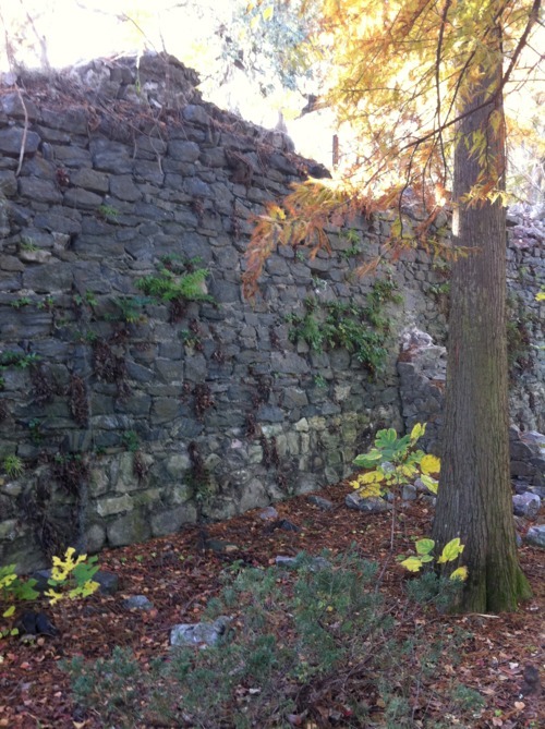
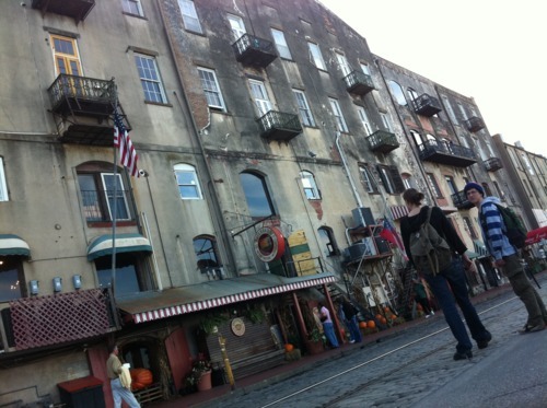
Professor Dove took us down for River Street for a fun afternoon of research. We spent the afternoon wandering around the river and snapping reference photos of old buildings, dark alley ways, and tourist shops. I'm not sure the locals appreciated our visit... we wouldn't stop screaming, laughing, and climbing on stuff. The following photos were taken by the amazing Allison. Check out her blog here for more pictures: http://azbat.tumblr.com/
It was definitely the best fieldtrip ever. We even got to grab some icecream, sample honey, and ride the ferry across the river a couple times. If anyone needs to take Drawing for Sequential art--PLEASE take it with Dove. It was pretty rad.
The next day I began my least favorite part of any assignment---drudging through the thumbnails. This is always such a headachy-grueling process for me. But IT IS VERY HELPFUL. I have learned that it is much better to plan out artwork in a small space than to immediately launch into the final piece and constantly have to start over. Nobody likes eraser crumbs and nasty smudges on their final work.
I've earned a reputation as the 'dinosaur girl' in my class. I guess I draw dinos and monsters a little too often. Living up to my name, I originally wanted River Street to be invaded by a group of T-rex...
I kept doodling rhinos instead. I don't get it either.
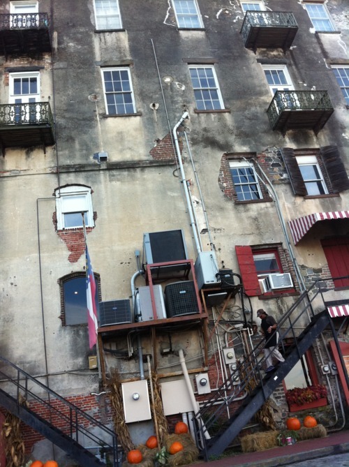
A bad habit of drawing the figures or beasts in my drawing first (the part I'm actually interested in) and then saving the architecture of the scene for last. This is a horrible idea. So I went out of my comfort zone and focused all my thumbnails on the architecture FIRST. I forced my self to do all the boring work right away. This was the scene I chose, photographed by me.
I liked the overall composition of the piece. The architecture was like a backdrop and there was plenty of room to draw my figures in the foreground. Here is my original thumbnail.
From there I imported the file into photoshop to try to make the structure more precise.
These first two dissections weren't going as I planned at all. I tried to grid the building so I could place the windows accordingly. It just turned into a mess. It was honestly easier just to crudely trace the photograph so that I would view the elements in a more basic way.
I'm not sure where my inspiration for this piece came from. For some reason I came up with travelers riding rhinos into River Street. My third figure was originally a character in the foreground perhaps welcoming the hippie people. I could not scale the foreground figure properly, so I ditched the idea.
I kept my rhinos, but this time I drew little street-urchin orphan children running excitedly to the visitors. This had a more readable story. It gave the sense that the travelers had visited before and were heroes among the children.
Guess what? I don't know what the heck running children look like. I was WAY off in the previous thumbnail. I totally abandoned my knowledge of human mechanics--disregarded the fact that moving limbs swing oppositely. Arms and legs on the same side do not lunge in the same direction. That's why it's important to do your homework, kids!
again I traced some silhouettes of running children so that I could understand the images more clearly. This was my final reference picture as I began working on the final piece on bristol.
There were many revisions from the digital study thumbnail, as you can see. This was my progress on the piece when I had it reviewed by my professor. He suggested some modifications to the windows and develop the background building more. Also, the clouds were poorly shaped and were facing the wrong way. Here is the revised line art.
Our class was given the option to leave the piece as line art or to push it further into a final, rendered piece. I was lucky enough to have the spare time to full shade the drawing with graphite. It was a lot of extra work, and for awhile I doubted I would finish...
But, praise the Lord, I pushed through to the end. I'm very proud of how this piece turned out.
The critique went well. People seemed to enjoy the originality of the drawing. If I could have done anything differently, I would have added more texture to the skin of the rhinos and maybe refined the facial features of my characters.
That's it. Finals are over. I'll be home in no time!




0 comments:
Post a Comment